
Company:
Tripla
Year:
2021 - 2023
Team:
UX designer, Product Owner, BE Developer, FE Developer
Issue:
Many hotels offered an average of 20 room types, each with lengthy descriptions. This resulted in an overly long list that was hard to scan, compare, and navigate.
Challenge:
Improve conversion by reducing on-screen complexity, while preserving enough information for users to evaluate and compare room options.
Outcome:
The amount of information displayed per screen was significantly reduced, improving scannability and comparability across room options. This led to a 5% increase in bookings, growing from 18 million to 21 million bookings over three years, while also reducing excessive scrolling and decision fatigue.
Presented multiple design options; after several iterations, the team aligned on a final design:
🟢 Moved the package information section next to the images.
🔴 Hid descriptions behind a modal.
🔵 Replaced adults and children icons by words.
🟠 Removed the image carrousel under room section.

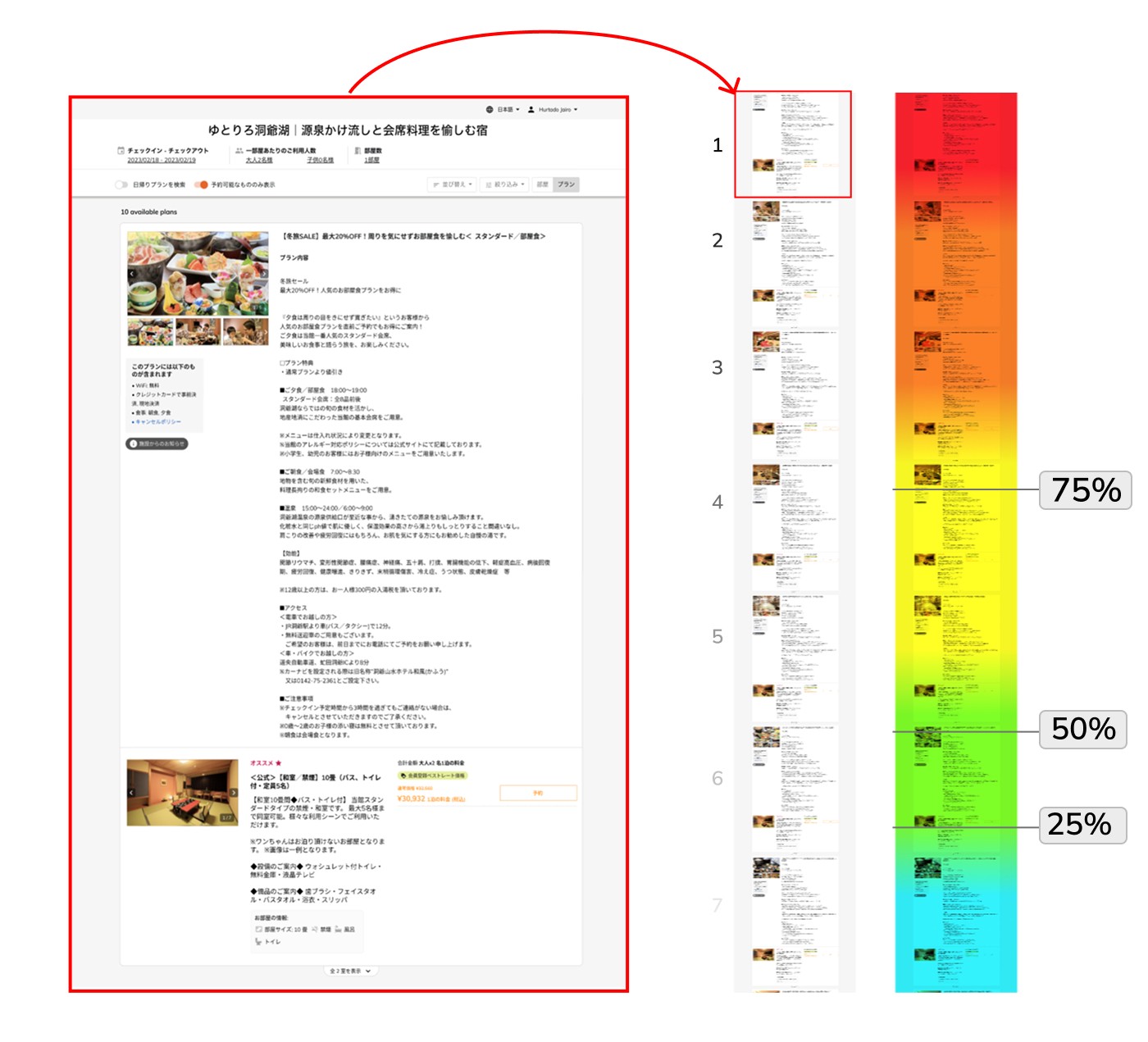
I had the hypothesis users were not seeing most of the options available. To validate my it, we partnered with one of our customers to run a heat-map test. The hotel had listed a total of 14 plans. The test was run for 1 month and reached over 1000 users. The findings were as expected. Most users were reaching up to the third room, but beyond that the number of users reaching further down quickly started to fall.
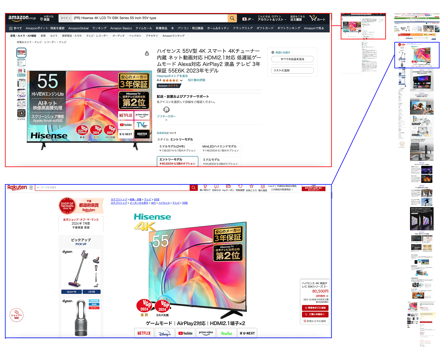
While in Western countries product descriptions tend to be short and concise, in Japan it tends to be long and detailed. We can just compare how the most most popular marketplaces in Japan (Rakuten) and abroad (Amazon) show the same product.
Although this way of presenting the information is a good cultural fit to what Japanese customers are used to, I had two hypothesis:
1. This was making the search result very difficult to compare between options.
The long scrolling needed meant the bottom options would never be seen.
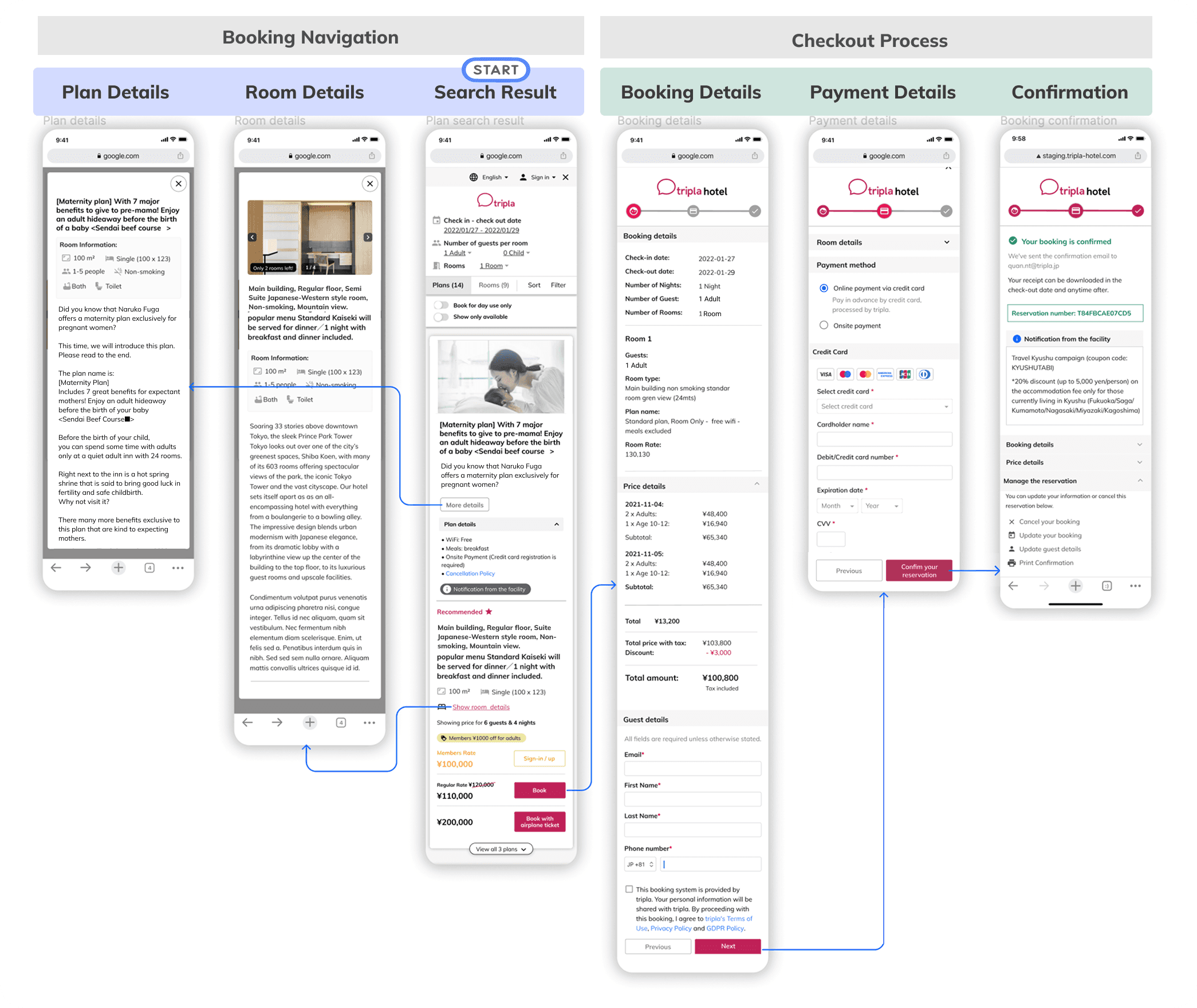
To present different users scenarios and design alternatives, I used wireframes and prototypes to instigate conversations and facilitate feedback from the stakeholders.
This enabled me to pinpoint critical areas of concern, facilitating the discovery of a common ground where we could all agree and shape the product concept.
I needed to find a middle point between a high quantity of information (Japanese UI) and a minimal approach (Western UI). A balance where Japanese users would feel comfortable to navigate between rooms without feeling a lack of information and consequently mistrusting it and leaving mid-journey.

Tree Hotels Japan Co., Ltd.
Hiroshi Maeda, Representative Director
The attractiveness of Triplas's reservation screen is its simple UI, which is common overseas. As a future growth scenario for our company, there was a major pillar of global expansion, so we chose Tripla because we thought that a foreigner-friendly UI was necessary.
https://tripla.io/portfolio-item/itsukihotelsjapan/
Customer response after launch was positive, with hotel reservation rates steadily increasing month over month. Temporary declines aligned with periods of strict border controls and social distancing measures during the COVID-19 pandemic, which restricted non-essential travel.
Working at this scale surfaced key design insights. While Japanese web experiences often prioritize information density over minimalism, this project required a different approach. Behavioral data showed that most users rarely scrolled beyond the midpoint of the results page, making hierarchy, prioritization, and scanability essential when presenting a large volume of room options.
Tripla is a Japanese B2B PMS (Property Management Software) that allows hotel managers to do tasks such as managing reservations, tracking occupancy, generating invoices and receipts, and maintaining financial records.