
Company:
Adlibris
Year:
2019 (8 months)
Issue:
The existing product page suffered from poor information hierarchy and visual overload. Key purchase signals (price and add-to-cart) lacked contrast, while secondary elements competed for attention, reducing clarity and conversion.
Challenge:
To redesign the product page to improve decision-making and conversion—particularly on mobile—while reducing cognitive load without removing essential information, and to deliver a scalable template that could be reused across multiple product types.
Outcome:
Post-release analysis and testing showed an increase in add-to-cart interactions driven by clearer CTA placement and improved above-the-fold visibility on mobile. Users reached key information faster, as reflected in reduced scroll depth before first interaction, and overall usability scores improved in internal reviews and qualitative feedback, particularly among mobile users.
Iterations
After several rounds of UX research, I went into redesigning the Product detail page. Different products needed to have different information sections.
Since the project began with an internal request to create a single, scalable template that could work across all product categories, my approach focused on designing a flexible system grounded in research. User insights directly informed the structure, hierarchy, and interaction patterns of the final solution.
On mobile in particular, several key iterations shaped the outcome:
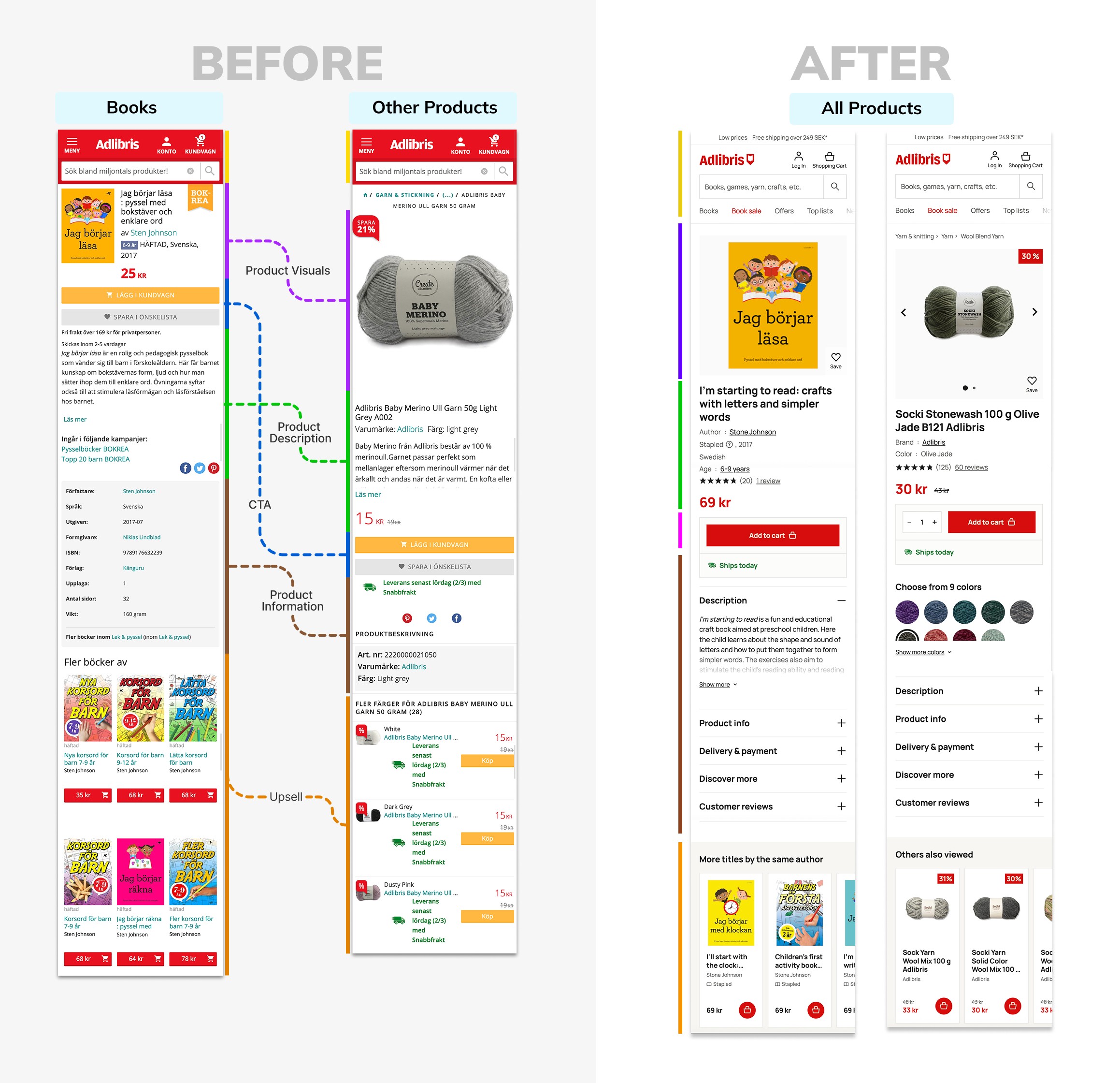
🟡 Top navigation update – Inverted the top bar colors to improve clarity and brand visibility (red logo on white background).
🟣 Unified product media – Standardized image and video layouts across categories. Moved “Add to wishlist” to the bottom-right for better reachability.
🟢 Clearer hierarchy – Placed key purchase variables above the CTA. Standardized heading sizes and colors to reduce cognitive load.
🔵 Accessible CTA – Replaced the low-contrast yellow CTA with red to meet accessibility standards and increase prominence. Added a quantity selector for bulk purchases.
🟤 Structured product info – Grouped details into subcategories and implemented dropdowns for easier scanning.
🟠 Upsell optimization – Replaced static rows with horizontal carousels per category to reduce scrolling and improve discoverability.
On desktop, I leveraged the wider viewport to support comparison and decision-making. Product media and key purchase variables were displayed side-by-side, keeping the CTA persistently visible without overwhelming the layout. Additional product information remained structured into expandable sections, ensuring consistency with mobile while taking advantage of the available space.
The result was a cohesive, scalable template across devices, improving clarity, consistency, and conversion focus.
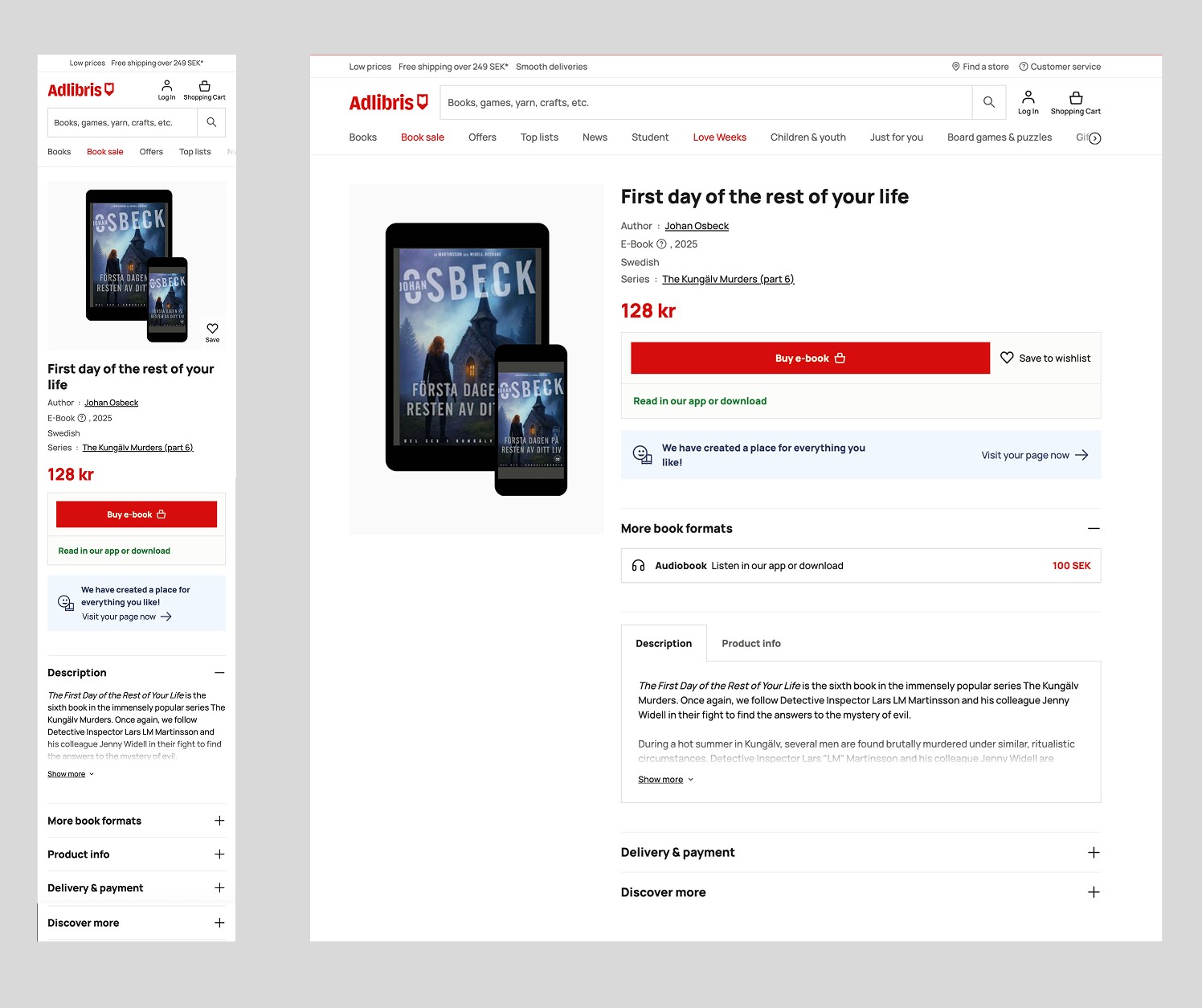
E-book
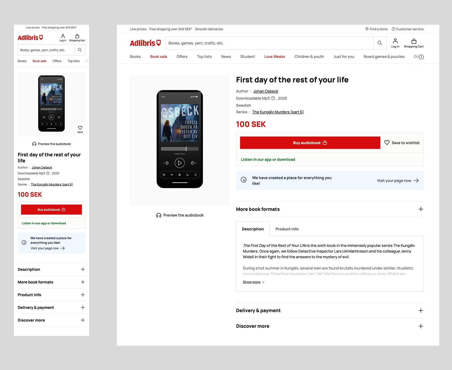
Audio Book
User Testing
As Adlibris has a store in the heart of Stockholm, we conducted on-site interviews to answer two key questions:
1. How were users using the product page?
2. What users wish it had?
We decided to focus on Mobile first as it’s the device with most traffic. On Cyber Monday 2018, 54% of all visitors came from mobile devices. We conducted interviews with a total of 10 individuals, with 8 using mobile devices and 2 using tablets. Each of them got an Adlibris voucher they could redeem in the shop. Some key insights gathered after the interviews were as follows:
• For products available in different colors, they noted that there’s no possibility of checking the different options without leaving the product page.
• People wanted to be able to zoom into the product and have a better view of it.
• Yarn customers buy 8 yarns per order on average, so the option to choose the number of units in the product page was valuable for them.

Another method we applied was using heat-maps through Hotjar. They showed how users were really using the non-books product page and wouldn’t be said during the interviews.
The results dropped some very interesting facts. Naturally, people would press on add to basket and read more. But the CTA That got the most clicks was see more under the other colour suggestions. That was said in the interviews and it was shown here as well. It also showed that users would scroll down until the “see more” CTA and would ignore the “you might like” section and the footer.
About Adlibris
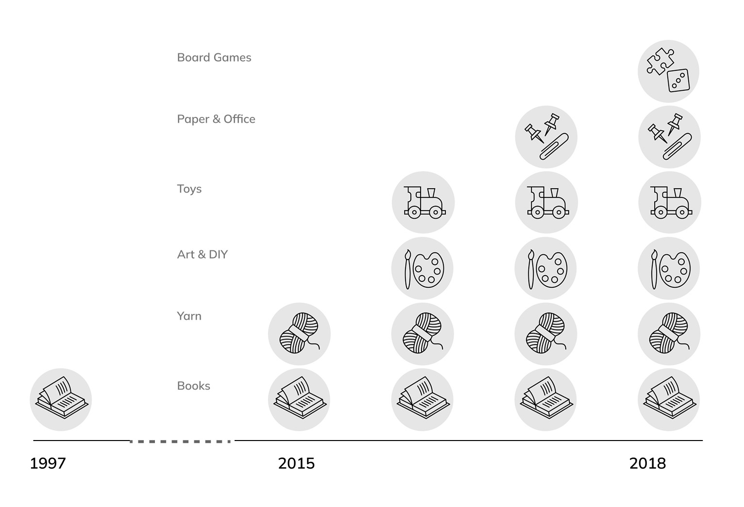
Adlibris was launched in 1997 and for 18 years it was exclusively dedicated to book sales. Since 2015 it started to diversify its product portfolio, adding 5 more categories. The company had positioned itself as one of the most popular e-commerce sites in Sweden with an average of 50.000 daily visits.
Of the total visits to the site, 10% are to the product page. As the purchase decision is made here, it’s one of the most important pages in the site. With a conversion rate of 3%, we knew we could increase it, so the product team was tasked to get users insights and identify issues in order to increase the conversion rate.